
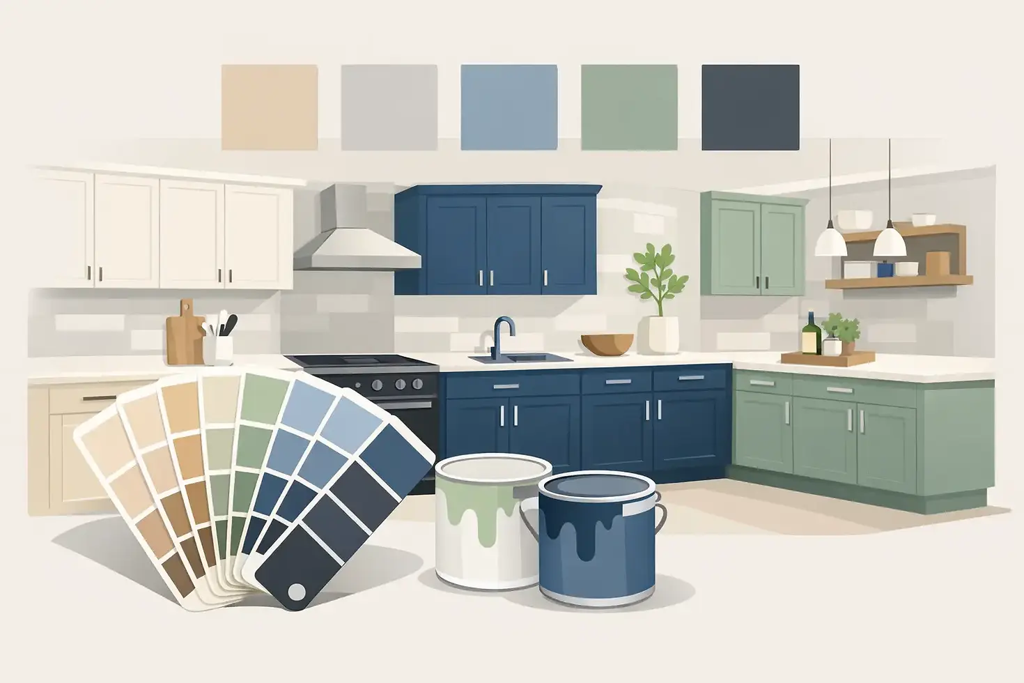
12 Best Cabinet Paint Colors for Kitchens
A cabinet color can make your kitchen feel cleaner, brighter, warmer, or more current before you change anything else. That is why choosing the best cabinet paint colors is often the biggest decision in a kitchen refresh. Get it right, and older cabinets can feel custom. Get it wrong, and even a good paint job can feel out of place.
For most homeowners, the challenge is not finding a color they like. It is finding one that still looks right in their lighting, works with their countertops and floors, and feels just as good six months from now. The best choices tend to balance style with staying power.
What makes the best cabinet paint colors work
Cabinet color is different from wall color. Cabinets take up more visual space, sit next to hard surfaces like stone and tile, and get viewed in changing light throughout the day. A paint chip that looks soft and neutral on a wall can read yellow, gray, or flat once it covers every cabinet door.
That is why the best cabinet paint colors usually have a little more depth and intention than homeowners expect. They need to coordinate with fixed finishes, but they also need enough character to carry the room. A kitchen with warm wood floors, cream counters, and low natural light will not respond the same way as a bright kitchen with cool quartz and stainless steel.
It also helps to think beyond trends. Trend-driven colors can be beautiful, but cabinets are not as easy to repaint as a bedroom wall. Most homeowners want a result that feels updated now without feeling dated too quickly.
Best cabinet paint colors homeowners keep coming back to
Some shades stay popular for a reason. They are flexible, attractive, and easier to live with over time.
Warm white
Warm white remains one of the safest and strongest options for kitchen cabinets. It gives a clean look without the starkness that can make a kitchen feel cold. In homes with beige tile, warmer counters, or cream backsplashes, a warm white often feels more natural than a bright white.
The trade-off is that not every warm white looks fresh. Some can lean too yellow if the room already has a lot of warm surfaces. The key is choosing a white with softness, not one that looks buttery.
Soft greige
Greige sits between gray and beige, which makes it one of the most forgiving cabinet colors available. It works especially well in kitchens that need a neutral update but are not suited to crisp white. If your flooring, countertops, or backsplash have mixed undertones, greige can help tie them together.
This is also a good option for homeowners who want a classic look with a little more warmth and depth. It feels calm, polished, and easy to decorate around.
Light gray
Light gray had a major run for several years, and it still works in the right kitchen. It pairs well with cooler countertops, brushed nickel hardware, and modern finishes. In the right setting, it gives cabinets a clean, tailored look.
Still, this is one of those colors where it depends. In warm lighting or alongside warm flooring, some grays can feel disconnected. If the rest of the kitchen leans warm, gray may not be your best choice.
Creamy off-white
A creamy off-white is ideal for homeowners who want brightness without a sharp contrast. It is especially useful in kitchens with traditional details, wood accents, or a softer overall design style. It can make older cabinets feel refreshed while still respecting the character of the home.
This color family tends to be more inviting than stark white, which matters in kitchens that open into living spaces.
Taupe
Taupe cabinets offer a grounded, upscale look that feels understated. It is a strong choice when white feels too expected and dark paint feels too heavy. Taupe works well with black hardware, natural wood tones, and stone surfaces with beige or brown movement.
It does require some care in selection. Too much gray, and it can feel muddy. Too much brown, and it can look dated.
Navy blue
Navy has become one of the most trusted bold cabinet colors because it adds richness without feeling overly trendy. It works particularly well on lower cabinets or islands, especially when paired with lighter uppers or bright counters.
A true navy can bring contrast and depth to a kitchen, but it is not the right fit for every space. In a small kitchen with limited light, using navy on every cabinet may make the room feel heavier. Used thoughtfully, though, it can look beautiful and timeless.
Deep green
Deep green has earned its place among the best cabinet paint colors because it feels both current and grounded. Shades with muted olive, forest, or smoky undertones can add personality while still feeling sophisticated.
This color tends to work best in kitchens with warm metals, wood accents, or natural textures. It gives a custom feel that stands out from standard neutrals, but it still has enough restraint for everyday living.
Blue-gray
Blue-gray is a softer alternative to navy or standard gray. It can create a calm, airy look without feeling plain. In kitchens near windows or in homes with coastal or transitional styling, blue-gray often feels especially at home.
The caution here is undertone. Some blue-grays can read more blue than expected once they are applied in larger areas. Testing is important.
Charcoal
Charcoal cabinets can be striking, modern, and very polished. They pair well with white counters, brass hardware, and clean-lined kitchens. For some homes, charcoal delivers the depth of black without the harshness.
That said, darker cabinet colors show dust, fingerprints, and wear more readily than mid-tone neutrals. They also require the right lighting to feel intentional instead of heavy.
Black
Black cabinets are bold, dramatic, and best used with confidence. In the right kitchen, they can look elegant and high-end. They are often strongest in larger spaces, on islands, or when paired with plenty of contrast from counters, walls, and backsplash materials.
For homeowners who want a light, open feeling, black usually works better as an accent than a full-room choice.
Sage green
Sage green is softer and more relaxed than deeper greens. It brings color into the kitchen in a way that still feels approachable. Many homeowners like sage because it adds personality without dominating the room.
It tends to work especially well in kitchens with natural light, warm wood, and softer design finishes. If you want something more distinctive than white or greige but still easy to live with, sage is worth a close look.
Natural-looking beige
Beige is returning in a more refined way than many people expect. Today’s better beige cabinet colors are less yellow and more balanced, giving kitchens warmth without the heavy look older beige paints sometimes had.
This can be a smart choice for homeowners who want a welcoming kitchen that does not feel stark or trendy. Beige also tends to sit comfortably with many of the warmer finishes common in Florida homes.
How to choose the right cabinet color for your kitchen
The best starting point is not your favorite paint chip. It is the surfaces you are not changing. Look closely at your countertops, backsplash, flooring, and even nearby wall colors. Those fixed elements will tell you whether your cabinet color should lean warm, cool, light, or deep.
Lighting matters just as much. A color that looks perfect in a showroom or online photo can shift dramatically in your home. South-facing kitchens often bring out warmth. Lower-light kitchens can make colors look flatter or darker. That is one reason cabinet painting deserves a careful, finish-focused approach rather than a quick decision.
Style matters too, but it should follow the room. If your kitchen has traditional details, a softer white, cream, or taupe may feel more natural than a cool modern gray. If your space is more contemporary, charcoal, navy, or crisp neutrals may fit better.
Why sample boards matter more than paint chips
Small swatches can be misleading, especially on cabinets. A color that feels subtle on a two-inch chip may become much stronger across an entire kitchen. Large sample boards let you move the color around the room and see it next to your counters, floor, and backsplash throughout the day.
This step can save homeowners from common regrets. Many cabinet color disappointments happen because the shade itself was not bad. It just was not tested in the right setting.
The finish and application matter as much as the color
Even the best cabinet paint colors will disappoint if the finish looks rough, inconsistent, or worn too quickly. Cabinets are one of the most visible surfaces in the home, and they need a smooth, durable finish to look right. Prep, product choice, and application all affect the final result.
That is often where professional cabinet painting makes the difference. A carefully selected color looks better when the finish is clean, even, and built to hold up in a hardworking space like the kitchen. For homeowners investing in a refresh, that combination of color choice and craftsmanship is what creates a result that feels worth it.
If you are narrowing down colors now, trust the kitchen you actually have, not just the trend you saw online. The right cabinet color should make your space feel more like home every time you walk into it.


Comments