

Interior Color Trends That Feel Right at Home
A fresh coat of paint can make a familiar room feel considered again, but the best interior color trends are not about chasing a look that will feel dated next year. For most homeowners, the goal is simpler: create rooms that feel comfortable, reflect the home’s character, and work with the furnishings and light already in place.
The current direction is warmer, more personal, and less dependent on all-white walls. Soft earth tones, grounded neutrals, deep accents, and painted cabinetry are giving homes a polished update without making them feel like a showroom. The right choice still depends on your space, though. Natural light, ceiling height, flooring, and how a room is used should guide the final palette.
Interior Color Trends Moving Beyond Cool Gray
Cool gray had a long run because it felt clean and easy to coordinate. It can still work in the right setting, especially when it has warmth underneath it, but many homeowners are now choosing colors that make a room feel more settled and inviting.
Warm neutrals with more depth
Creamy off-whites, soft taupes, mushroom shades, light camel, and warm greige are replacing the stark white-and-gray combinations seen in many recent renovations. These colors offer flexibility, but they do not disappear into the background. A warm neutral can make trim, wood furniture, tile, and artwork feel more connected.
The key is choosing a neutral with the right undertone. A creamy white can look beautiful beside warm wood floors but may look yellow next to bright white quartz. A taupe that feels sophisticated in a north-facing bedroom can appear too cool in a sun-filled living room. Sampling paint on multiple walls and checking it throughout the day is worth the extra time.
Nature-inspired greens and blues
Muted green remains one of the most useful color families for interiors. Sage, olive, eucalyptus, moss, and soft khaki green bring color into a room without overwhelming it. They pair naturally with black hardware, brass fixtures, oak, woven textures, and warm white walls.
Blue is shifting away from icy or overly bright shades toward dustier, calmer choices. Blue-gray, smoky navy, muted denim, and softened teal can add definition to a home office, bedroom, dining room, or powder room. A deeper blue may feel dramatic on all four walls in a small room, while a mid-tone version can create a quieter effect.
Earth tones that feel tailored, not heavy
Terracotta, clay, cinnamon, muted rust, and warm brown are appearing in accent spaces and carefully selected rooms. These colors have presence, so placement matters. A warm clay tone can bring life to a dining room or entryway, but it may feel too intense in an already dark hallway.
Used with balance, earthy shades are not a passing novelty. They work especially well with natural materials and homes that need warmth after years of cooler paint choices. Consider them on a single focal wall, a ceiling, built-in shelving, or a powder room where a stronger color can feel intentional rather than overwhelming.
Color-Drenched Rooms Are Gaining Ground
For years, the standard approach was white trim, white ceilings, and a contrasting wall color. That classic formula remains a reliable option, particularly when homeowners want a bright, familiar look. Yet color drenching is becoming a popular alternative for rooms that need personality.
Color drenching means using one color, or closely related shades, across the walls, trim, doors, and sometimes the ceiling. It can make a small room feel cohesive because the eye is not stopping at sharp contrast points. It also highlights architectural details in a subtler way than bright white trim.
This approach is especially effective in powder rooms, offices, bedrooms, libraries, and dining rooms. A muted olive, smoky blue, soft brown, or warm charcoal can feel refined when carried through the room in a consistent finish plan. It is less practical if you prefer frequent furniture changes or want every room to feel open and bright. The color needs to be one you will enjoy living with, not just one that looks striking in a photo.
Painted Cabinets Remain a High-Impact Update
Cabinet color is one of the clearest ways to change the feel of a kitchen or bathroom without taking on a full replacement project. White cabinets are still a classic choice, but the strongest cabinet trends lean toward warmth and contrast.
Soft warm whites, mushroom tones, muted green, deep navy, charcoal, and medium wood-inspired browns are all being used to give kitchens more character. In many homes, a two-tone approach is a smart middle ground: a lighter perimeter cabinet color keeps the room open, while a darker island or lower cabinets provide visual weight.
A cabinet color should be chosen alongside the countertop, backsplash, flooring, and hardware rather than in isolation. Deep green cabinets can look rich with warm brass and light stone, but they may compete with a busy patterned backsplash. A creamy cabinet color may soften a kitchen with cool countertops, while a warm greige can bridge white walls and natural wood accents.
Cabinet painting also demands more preparation and finish control than a typical wall repaint. Kitchen cabinets are touched, cleaned, and exposed to moisture every day. Proper cleaning, sanding, priming, and durable coating selection make the difference between a finish that looks good at first and one that holds up over time.
How to Choose a Trend That Works in Your Home
A color can be on trend and still be wrong for the room. Before committing, start with what is staying. Floors, tile, stone counters, upholstered furniture, and large wood pieces carry undertones that paint needs to support. A new wall color should make those fixed elements look better, not call attention to a mismatch.
Light is equally important. Florida homes often receive strong daylight, which can make pale colors appear brighter and bring out unexpected undertones. A warm white that looks neutral in the store may read creamy in a sunny room. In rooms with less natural light, a deep color can create a cozy atmosphere, but it may also make the space feel closed in if the lighting plan is limited.
Try large sample areas instead of relying on a small paint chip. View them in morning light, afternoon sun, and evening artificial light. Place samples near cabinets, counters, flooring, and window treatments. This small step prevents many costly second guesses.
For a whole-home update, choose a simple color story rather than selecting each room separately. That does not mean every room needs the same shade. A consistent warm white or neutral in connecting spaces can create flow, while bedrooms, bathrooms, and dining areas can carry more individual color.
Finish Matters as Much as the Color
The same paint color can look noticeably different based on sheen. Flat or matte finishes soften wall imperfections and create a calm appearance, but they may be less forgiving in busy spaces. Eggshell and satin are common choices for walls because they offer a light washable finish without too much shine.
Semi-gloss is often used for trim, doors, and cabinetry because it is durable and easier to clean. Higher sheen also reflects more light, which can make a strong cabinet color look more dramatic. In a kitchen, the finish should support both the desired look and the daily demands of the space.
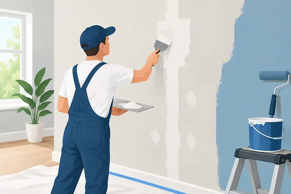
Thoughtful surface preparation is part of the final result as well. Even the best color will not look polished on uneven repairs, poorly prepped trim, or cabinet doors with a weak coating. Professional painting is as much about the finish beneath the color as the color itself.
A Home Should Feel Personal, Not Perfectly Trendy
Trends are useful when they help you put words to a feeling you already want in your home: warmer, calmer, brighter, more grounded, or more distinctive. They are less useful when they pressure you into a color that does not fit your routines or taste.
If you are considering a full interior refresh or a cabinet transformation, Eventide Painting Company can help you weigh color, finish, and the practical details before work begins. A clear plan and careful preparation make the process easier from the first sample to the final walkthrough.
Choose the color that makes you pause at the doorway and feel glad to be home. That is a result that will outlast any trend cycle.


Comments